Tuesday 26 January 2016


Bokeh

Examples


These are card lense covers with shapes cut out to create the effects above. 

Final Images
These overall didnt turn out the best as the cut out wasnt very clean cut so to improve this the cut out needs to be neater, the settings used were correct which did give the right effect.
I liked this image for then the hearts as it looks much neater and can I could also use double exposure with another image which could create an interesting image.

Contact Sheets


Thursday 21 January 2016

Match box camera
what you need:
match box 
insulation tape 
marker pen
ring pull from can
scissors
pin 
knife
film
sellotape


Shoes
I took this picture inspired by the artist  Pol Ubeda Hervàs and I think it looks effective as the shadow gives the effect it's almost wearing the trainers. The contrast of light worked well to give a bold shadow which shows the bright orange of the shoe. Also the dark empty space also adds drama to the picture as if something could appear beneath it. 


 Another picture I've taken inspired by Blanc looks bizarre and unusual, and gives they illusion the feet are bigger then the body. Also the use of a black and white filter shoes of the various tones to the photograph. Also the angle it has been taken at give a vast depth by the lines in the flooring and how the sunlight stream through.


Another picture I've taken inspired by Blanc looks bizarre and unusual, and gives they illusion the feet are bigger then the body. Also the use of a black and white filter shoes of the various tones to the photograph. Also the angle it has been taken at give a vast depth by the lines in the flooring and how the sunlight stream through. 


 This photo from online has been cleverly taken using the reflection of the man in the water and then maybe using photoshop they have got rid of the body. I like this picture becuase it's unusual and clever, and the space around makes the image simple with no distractions.


This piece from the artist Lou Blanc inspired some of my pictures, and think The tones look very effective also and the angle it's taken  makes it very creative giving it interesting form and shape.


This photograph I took of hanging shoes from a branch I thought was a different way of presenting them and also catches the eye. The bright blue sky also contrasts well with the natural green pine, and then white shoes show tones from where the light hits them.

contact sheets 

Friday 15 January 2016

Time Lapse 

Sam Javanrouh

This time lapse was created by the artist Javanrouh which was taken in a two hour time frame made up of 6 photos, he used PCLIX to create this effect which allows you to trigger the shutter to your digital camera at much shorter intervals than is possible manually.

 This was my time lapse Ive made which looks effective with the high contrast clouds but the telephone wire in the photo takes the eye away from the changing sky and isn't very aesthetically pleasing.


Friday 8 January 2016

water colour style and step by step
 

I like this piece with the subtle colours which sets a calm relaxed atmosphere and makes it seem dreamy. The picture works well with this effect because water colours are a very delicate media to use and the sky looks very washed out a blended already. To improve this I would make sure more of the coffee stain paper is visible to give the idea its a painting, and when rubbing it id make sections lighter and darker to add tone giving a painting effect. To improve the composition i would make sure the line isn't in the picture also, as it cuts the picture up. 


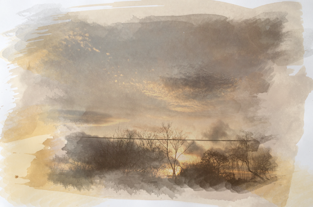
The high cotrast trees add dynamics to the photo as they stand out against the bright blue and orange sky, and i like the the gaps of the paint strokes to make it seem more like a painting. To imrove the composition i woudld have less darker trees as it does cover alot of the photo and there isnt an overall vocus point as its too busy. I would also use less oranges and blues i added around it as again it look a bit messy and take yours eyes off the main photo. 


This picture I found worked more effectively with the deep colours and catches the eye, the orange against the dark landscape also contrasts well and adds drama. The oranges and reds add warmth to the picture, also the blue section compliment the oranges. I have also used the bush tool harder and lighter in sections to add tone. Then to improve the piece i could leave some parts with no paint to make it disjointed and look like an unfinished painting. 

Step by Step
 
1st I had two pictures which are two separate layers, i changed the picture of coffee stained paper opacity lower of around 70-80%...


Then making sure layer two of my main photograph is bellow layer 1 I grouped the layers I then went on layer mask and hide all


I then selected the 1st brush tool and almost wiped away the background and the layer 2 appeared... 


Finally to make the piece blend better together I added paint marks around it of the same colours  tones...
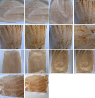

Contact Sheets 


Emulation Plan

I've taken one my photos and copied it in watercolour to create the tilt shift and water colour style, with the blended colours created by the water colours. This effect works well with the contrasting colours and high saturation. 


Examples of watercolour style