water colour style and step by step
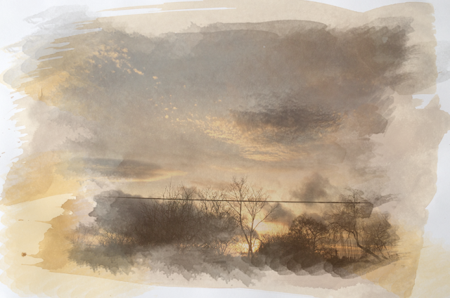
I like this piece with the subtle colours which sets a calm relaxed atmosphere and makes it seem dreamy. The picture works well with this effect because water colours are a very delicate media to use and the sky looks very washed out a blended already. To improve this I would make sure more of the coffee stain paper is visible to give the idea its a painting, and when rubbing it id make sections lighter and darker to add tone giving a painting effect. To improve the composition i would make sure the line isn't in the picture also, as it cuts the picture up.
I like this piece with the subtle colours which sets a calm relaxed atmosphere and makes it seem dreamy. The picture works well with this effect because water colours are a very delicate media to use and the sky looks very washed out a blended already. To improve this I would make sure more of the coffee stain paper is visible to give the idea its a painting, and when rubbing it id make sections lighter and darker to add tone giving a painting effect. To improve the composition i would make sure the line isn't in the picture also, as it cuts the picture up.
The high cotrast trees add dynamics to the photo as they stand out against the bright blue and orange sky, and i like the the gaps of the paint strokes to make it seem more like a painting. To imrove the composition i woudld have less darker trees as it does cover alot of the photo and there isnt an overall vocus point as its too busy. I would also use less oranges and blues i added around it as again it look a bit messy and take yours eyes off the main photo.
This picture I found worked more effectively with the deep colours and catches the eye, the orange against the dark landscape also contrasts well and adds drama. The oranges and reds add warmth to the picture, also the blue section compliment the oranges. I have also used the bush tool harder and lighter in sections to add tone. Then to improve the piece i could leave some parts with no paint to make it disjointed and look like an unfinished painting.
Step by Step
1st I had two pictures which are two separate layers, i changed the picture of coffee stained paper opacity lower of around 70-80%...
Then making sure layer two of my main photograph is bellow layer 1 I grouped the layers I then went on layer mask and hide all.
I then selected the 1st brush tool and almost wiped away the background and the layer 2 appeared...
Finally to make the piece blend better together I added paint marks around it of the same colours tones...


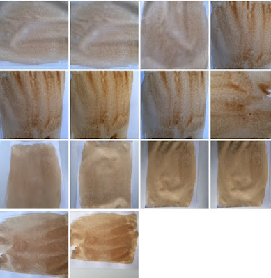
Excellent, there are a couple of typos but that's about it. Well done! Next step could be annotating your contact sheets
ReplyDeleteTilt shift and Water Colour Style are 2 different things, You have done the water colour style thing only
ReplyDeleteOne more thing, telephone lines are not nice.
ReplyDelete